Slow learner

Heliodorus, An Ethiopian Tale

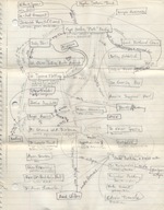
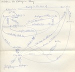
I was not a terribly casual young person. When I was about twenty-two, I saw in a Cambridge bookstore an edition of Collected Ancient Greek Novels. It seemed they were the earliest novels ever written. Since I wanted to write novels myself someday, I felt that I ought to purchase and read it. Unfortunately, the earliest novels ever written were not the best, by a long shot. They were meandering, melodramatic, and improbable. I don’t remember how many of the nine novels in the volume I read, because I don’t remember a word of any of them today. But there is incontrovertible evidence that I did read at least one, “An Ethiopian Story” by Heliodorus. I diagrammed it.

Ah, the earnestness of youth! I was just out of college, and I hadn’t yet determined on grad school, but I heard the call of note-taking, even though no one was ever going to quiz me. Until this post, I’m pretty sure that the fact of my having read Heliodorus’ “Ethopian Story” was a dark secret safely kept; it’s not a title that comes up a lot in Brooklyn cocktail-party conversation.

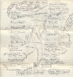
Pynchon, Gravity's Rainbow, diagram 1

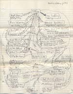
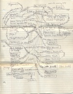
But I should level with you. I’m just warming up the audience, here. This post isn’t really about Heliodorus at all. It’s really about Thomas Pynchon, and the five-page diagram, along the same lines but on a much more grandiose scale, that I drew while reading Gravity’s Rainbow. I think I drew the Pynchon diagrams a year or two before the Heliodorus one; as you will see if you dare to click, the Pynchon diagrams are a bit more passionate, if not outright mad. Today there are reader’s companions to Gravity’s Rainbow, but there weren’t at the time. I’m not sure the diagrams will be useful to any other readers, but they were useful to me back then, partly as a memory aid, but mostly in the way of channelling and venting what felt like a possession. If you haven’t read Gravity’s Rainbow, and you wish you knew the human intermediaries that connect “Grigori (octopus)” to “Milton Gloaming (statistician)”; or if you happen to be in the midst of reading the novel, and it would help to be reminded that “Geli Tripping (balalaika, witch)” is in the harem of “Vaslav Tchitcherine”; or if you just want to admire the way all the lines converge on Slothrop—then by all means knock yourself out.

Pynchon, Gravity's Rainbow, diagram 2 Pynchon, Gravity's Rainbow, diagram 3

Pynchon, Gravity's Rainbow, diagram 4 Pynchon, Gravity's Rainbow, diagram 5

Pattern in Material Book Culture

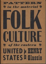
Folk_culture_cover I’ve threatened, at various times, to say unkind words about book design. But I realized recently that it would be better for my karma to say a few kind ones. In fact, there’s a lot of book design that I like, and it isn’t easy to choose which book to praise. It occurred to me that the purest selection would be of a book I haven’t actually read, so that any fondness I might have for content would be neutralized. And I haven’t actually read (not every page, anyway) Henry Glassie’s Pattern in the Material Folk Culture of the Eastern United States (University of Pennsylvania Press, 1968), which, according to the back flap of the dust jacket, was designed by someone named Bud Jacobs.

As a rule I’m not wild about typographic covers, but I like this one, because the wood-block lettering nods to the book’s theme of handmade culture and to its time period. You know at once that this is a book about America in the late nineteenth and early twentieth century, and that it’s a little nostalgic, but not fussily so. This is going to be a kind of playful remix. The size of the words corresponds to their importance: in descending order, Folk, Culture, United States, and Pattern. Also, no computer went near this cover. Every letter on it was manifestly kerned by eye and hand.

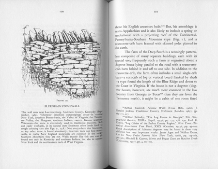
The page design for Pattern is a scholarly kind of beautiful. It geeks out, and it makes geeking out look lovely. The footnotes are at the feet of the pages, for one thing—not banished to the book’s end. This is important, because the notes are designed, as the author explains in his “Apology and Acknowledgment,” to “provide a loose bibliographical essay.” They’re a kind of anchor to the book’s text, which the author describes as an “impressionistic introduction.” The text meanders, while the footnotes march on, beneath, in an orderly regiment.

Stonewall

As a third design component, the book has many illustrations, one on nearly every other page, each of which comes with a leisurely caption, which in some cases amounts to a free-standing essay. In the layout above, for example, the caption discusses variations in stone walls, from New England to Kentucky, while the text focuses on the dogtrot house typical of farms in the Deep South, and a footnote directs the reader to descriptions of Alabama dogtrots in Evans and Agee’s Let Us Now Praise Famous Men, among other sources.

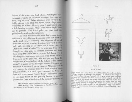
Glassie’s book isn’t merely bibliography and synthesis, however. Some of the information comes from his own field work. He presents a photograph of a rabbit gum, a wooden box trap to catch rabbits. And he prints an interview with a man who used to “sting” fish as a boy; when he saw a fish swimming just under the ice of a creek, he would hit the ice with a mallet to stun the fish beneath, and then cut the ice and take the stunned fish out. An illustration displays the man’s sketch, from memory, of his fish stinging mallet, and a footnote assures the reader that “stinging fish is not a tall tale” by pointing to a similar recollection in print elsewhere. But I’m becoming distracted from pure design, so here’s another layout, which mixes line drawings, a photograph, and a caption to show you how to make a slingshot out of a coathanger, West Philadelphia-style.

Slingshot

There’s an index of fearful completeness, of everything from bacon-grease salad dressing to lobster pots. And one more clever touch worth mentioning, the book’s spine:

Folk_culture_spine

Spines

It’s a little hard to read, because the technology was no longer really up to spec for machine-made books in 1968, but Bud Jacobs seems to have tried to gild the book’s spine in the style of American books of the mid-nineteenth century. Jacobs stamped the spine with an indicator hand, the book’s title, and the press’s insignia. Back in the day, gilded spines were even more elaborate, in many cases, and the gilding was applied by hand. To the right are a few samples from the 1840s and 1850s, featuring a philanthropess, a waif, and a den of iniquity; a conductor; floral bouquets; the scales of justice; and an all-seeing eye.