Marginalia

“To see a painting or a statue, he thought, and then to look out of the window, is to see how fresh and richer life itself is. He had read this a few weeks before in the volume of a German philosopher, and because Ezekiel had always felt so, the sentence had significance.” —Charles Reznikoff, By the Waters of Manhattan

Does anyone know which German philosopher Reznikoff’s hero was reading? I had the impression that the idea in question was originated by Muriel Spark, but Reznikoff’s novel was published in 1930, so this can’t be Spark in German drag. I bought (from Better Read than Dead) and read By the Waters of Manhattan because, shallow person that I am, I thought the cover of the paperback, by Amy Drevenstedt, was gorgeous, and as usual, my superficiality was rewarded. It’s a solid page-turner. The first two-thirds is about a Jewish woman growing up in eastern Europe in a family full of idealistic and often hapless men. The second is about her son starting a bookstore on the Lower East Side and venturing into a somewhat amoral romance with one of his customers.

A book cover, with the title and author's name hand-lettered, and an illustration of New York's Lower East Side with the Brooklyn Bridge as a backdrop


“Haven’t smoked for three days. Busy night and day not smoking. Already I can climb stairs better but that’s not much of a life. With smoking one has a life while dying. How did the Greeks ever run a whole culture without it? Maybe that’s why there was so much homosexuality.” —Russell Hoban, Turtle Diary


“Car horns serve the same purpose as birdsong—to warn away rivals, or to express annoyance.” —Sparrow, The Princeton Diary

This isn’t quite the case, of course, or anyway not exclusively—birds also use song for courtship, spooking prey, begging, and staying findable to mates and colleagues—but I lolled. I wrote a post about Sparrow’s previous novel, Abraham, a couple of years ago, and so far the new one is also very quotable (“Princeton is what New Jersey would be like without the mafia.”)


Years ago, soon after I landed my first real job, as a senior (sc. junior) editor at Lingua Franca, I bought a set of the old Houghton Mifflin / Riverside Press edition of Thoreau’s journals, which happened to have belonged to the late critic Alfred Kazin. I had read “in” Thoreau’s journals a fair amount in grad school, and I read “in” them some more when I did a Thoreau-related review soon after buying the set, but it was only last year that I sat down with the intention of reading them through. Having started birdwatching myself makes it more plausible, somehow. Sometimes I cross-check with the new Princeton edition, which I have many but not all volumes of, but I seem to prefer the old Riverside Press edition for actual reading, just as I seem to prefer the more-edited editions of John Clare. It turns out I’m not a purist and appreciate punctuation. Adding to the pleasure of the copy of Thoreau’s journal that I have are Kazin’s copious pencil annotations. I particularly liked this one, of Thoreau’s entry for October 14, 1851:

Alfred Kazin has written "Me" in pencil, beside this passage in Thoreau: "'Some men's lives are but an aspiration, a yearning toward a higher state, and they are wholly misapprehended, until they are referred to, or traced through, all their metamorphoses.'"
Me, too, by the way.


“She had no ambition to write a good book, but was painfully anxious to write a book that critics should say was good.” —Trollope, The Way We Live Now

Cover reveal

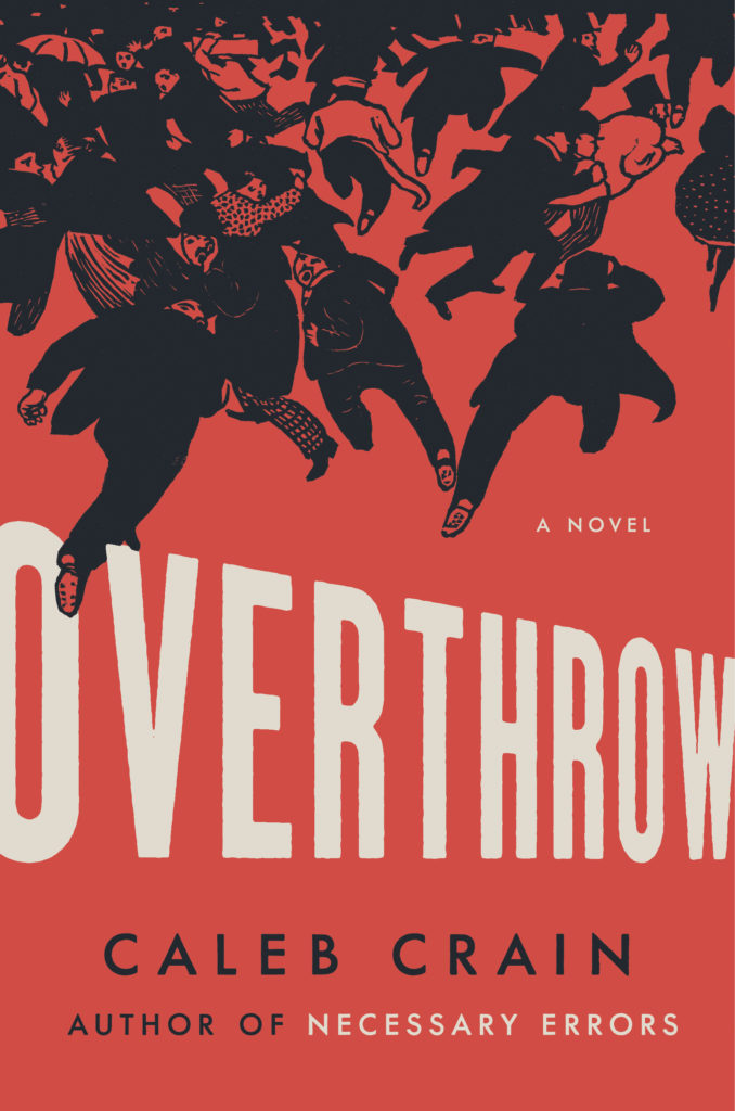
Overthrow: A Novel by Caleb Crain Viking 2019

I’m thrilled to be able to reveal the cover for my new novel, Overthrow, which is coming in August from Viking. The design is by the hugely talented Colin Webber, riffing on an 1893 print by Félix Vallotton called “La Manifestation” (“The Protest”).

Pre-order your copy now! A pre-order from you will help capitalism know that my book will reward the effort of selling it. You can order it from your local bookstore, Barnes & Noble, Amazon, and half a dozen other sellers, including Viking itself. Thanks!

The dress I’ll be going to the party in

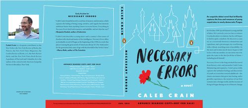
I’m pleased to introduce the cover to my forthcoming novel, Necessary Errors, which will be published by Penguin as a paperback original and an e-book in August. The cover is visible at the top of the right-hand column of this webpage—it’s the one in light blue. If you click on it, or if you direct your browser to steamthing.com/necessaryerrors, you’ll be led to a webpage for the book, hosted on this blog, which reprints the advance praise that a few early readers have been kind enough to send along.

Also, for the very curious, below is what the jacket for the advance reader’s copy looks like. It has what are known as French flaps, as the finished book will—though the finished book will look slightly different in other respects.

ARC jacket for Necessary Errors

Pattern in Material Book Culture

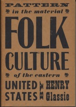
Folk_culture_cover I’ve threatened, at various times, to say unkind words about book design. But I realized recently that it would be better for my karma to say a few kind ones. In fact, there’s a lot of book design that I like, and it isn’t easy to choose which book to praise. It occurred to me that the purest selection would be of a book I haven’t actually read, so that any fondness I might have for content would be neutralized. And I haven’t actually read (not every page, anyway) Henry Glassie’s Pattern in the Material Folk Culture of the Eastern United States (University of Pennsylvania Press, 1968), which, according to the back flap of the dust jacket, was designed by someone named Bud Jacobs.

As a rule I’m not wild about typographic covers, but I like this one, because the wood-block lettering nods to the book’s theme of handmade culture and to its time period. You know at once that this is a book about America in the late nineteenth and early twentieth century, and that it’s a little nostalgic, but not fussily so. This is going to be a kind of playful remix. The size of the words corresponds to their importance: in descending order, Folk, Culture, United States, and Pattern. Also, no computer went near this cover. Every letter on it was manifestly kerned by eye and hand.

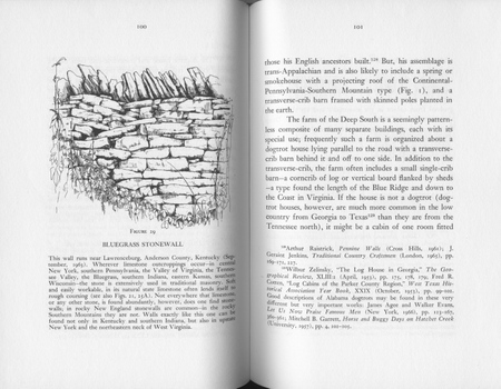
The page design for Pattern is a scholarly kind of beautiful. It geeks out, and it makes geeking out look lovely. The footnotes are at the feet of the pages, for one thing—not banished to the book’s end. This is important, because the notes are designed, as the author explains in his “Apology and Acknowledgment,” to “provide a loose bibliographical essay.” They’re a kind of anchor to the book’s text, which the author describes as an “impressionistic introduction.” The text meanders, while the footnotes march on, beneath, in an orderly regiment.

Stonewall

As a third design component, the book has many illustrations, one on nearly every other page, each of which comes with a leisurely caption, which in some cases amounts to a free-standing essay. In the layout above, for example, the caption discusses variations in stone walls, from New England to Kentucky, while the text focuses on the dogtrot house typical of farms in the Deep South, and a footnote directs the reader to descriptions of Alabama dogtrots in Evans and Agee’s Let Us Now Praise Famous Men, among other sources.

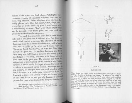
Glassie’s book isn’t merely bibliography and synthesis, however. Some of the information comes from his own field work. He presents a photograph of a rabbit gum, a wooden box trap to catch rabbits. And he prints an interview with a man who used to “sting” fish as a boy; when he saw a fish swimming just under the ice of a creek, he would hit the ice with a mallet to stun the fish beneath, and then cut the ice and take the stunned fish out. An illustration displays the man’s sketch, from memory, of his fish stinging mallet, and a footnote assures the reader that “stinging fish is not a tall tale” by pointing to a similar recollection in print elsewhere. But I’m becoming distracted from pure design, so here’s another layout, which mixes line drawings, a photograph, and a caption to show you how to make a slingshot out of a coathanger, West Philadelphia-style.

Slingshot

There’s an index of fearful completeness, of everything from bacon-grease salad dressing to lobster pots. And one more clever touch worth mentioning, the book’s spine:

Folk_culture_spine

Spines

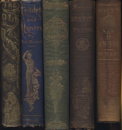
It’s a little hard to read, because the technology was no longer really up to spec for machine-made books in 1968, but Bud Jacobs seems to have tried to gild the book’s spine in the style of American books of the mid-nineteenth century. Jacobs stamped the spine with an indicator hand, the book’s title, and the press’s insignia. Back in the day, gilded spines were even more elaborate, in many cases, and the gilding was applied by hand. To the right are a few samples from the 1840s and 1850s, featuring a philanthropess, a waif, and a den of iniquity; a conductor; floral bouquets; the scales of justice; and an all-seeing eye.