
On Route 32, just north of Old County Road. Missing one antler. He came right up to the little gully of wildflowers by the side of the road.


On Route 32, just north of Old County Road. Missing one antler. He came right up to the little gully of wildflowers by the side of the road.
A new short story of mine, “Mr. Hutchinson,” is published in the August 2018 issue of Harper’s magazine.
For the 24 June 2018 issue of the New York Times Book Review, I wrote about Peter Ackroyd’s Queer City, a history of London’s two thousand years of nonconformity in gender and sexual orientation.
Actually, bonus round and afterthought.
First, the afterthought. In a recent post for The New Yorker taking a second look at data about American reading habits, I wrote that “there’s a little bit of good news: the average American reader spent 1.39 hours reading in 2003, rising to 1.48 hours in 2016.” But I’m not so sure now that that’s good news. I imagined a bulwark of readers who were redoubling their devotion to literature in a time of crisis, but another explanation of the surge occurs to me. Maybe we’ve lost the fair-weather, lightweight readers, and all that’s left is a core who have always spent serious time on reading.
Now the bonus round. One of the graphs of reading habits that I made got left on the cutting-room floor, because it seemed to require more explanation than it offered enlightenment. But here on my personal blog, I’m free to bore you a little if I want to. So here we go . . .
In my post, I parsed the reading habits of Americans by age. But because the American Time Use Survey, the source for my data, has now lasted more than a decade, it’s also possible to follow the progress of age cohorts—that is, to compare the reading habits of people who were 25 to 34 years old between 2003 and 2006 with those of people who were 35 to 44 years old between 2013 and 2016, and so on. I did so with five cohorts, using averages of the data from 2003 to 2006 and from 2013 to 2016, with the following dispiriting results:
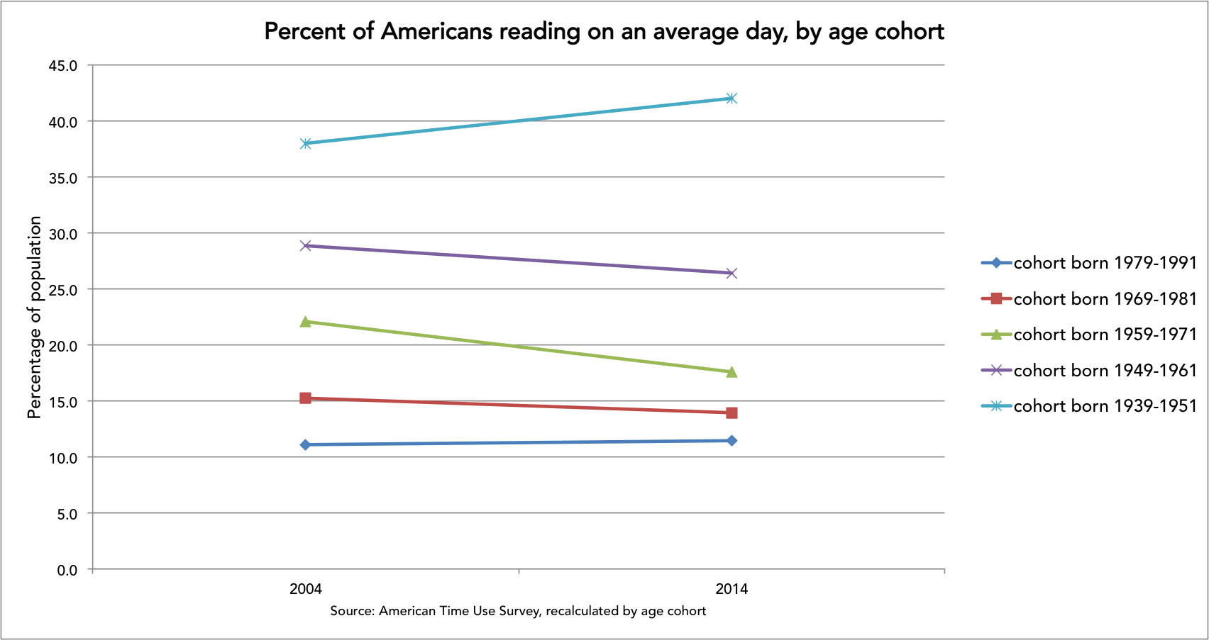
The youngest Americans in this graph, born in the 1980s, managed to increase their reading time a little over the course of the decade, but not by very much; it’s probably another case of what I refer to in my post as a dead-cat bounce. Every other age cohort read less at the end of the decade, except for the oldest, representing people born in the 1940s. That result may be untrustworthy, however, because my averages compare the 55-64-year-olds of 2003 to 2006 with those who were over 65 between 2013 and 2016, so there are late-septuagenarians, octogenarians, and nonagenarians in the mix, avidly reading and skewing the turquoise line higher than it deservedly should go.
Keep in mind that this graph is a little kludgier than the ones presented in and linked to in the original post (that’s why it got left on the cutting-room floor; sharp eyes will have noticed, for example, that the age cohorts that I’m comparing here overlap in birth years at the edges), but I think the overall pattern is suggestive enough for a blog on teh internet’s peripheries.
Over at the New Yorker’s website, I’ve revisited the numbers on Americans’ reading habits.