In this morning’s New York Times, David Brooks, citing a new book by Steven Pinker, claims that there’s been more economic good news in America lately than has been appreciated.
Brooks (or Pinker) sets up a bit of a strawman by claiming that a “smothering orthodoxy” of economic observers have been wrongly idealizing the 1950s. In fact it isn’t the 1950s per se that gets idealized, in the tracts I’ve read; it’s the progress that the American economy made following World War II, which abruptly stopped in about 1973. And if you kick the tires on some of the numbers in Brooks’s article, this “pessimistic” assessment holds its own.
Brooks writes, for example, that “Between 1979 and 2014, . . . the percentage of poor Americans dropped to 20 percent from 24 percent.” I don’t have Pinker’s book, so I’m not sure what the underlying source for this claim is, but it is contradicted by the US Census, which reports that in 1979, the percentage of Americans living in poverty was 11.7 and by 2016 had risen to 12.7. By the word “poor,” therefore, Brooks and Pinker must mean something other than “living in poverty.” For a fuller picture, here’s a quick graph I made, using the Census’s data, of the proportion of Americans living in poverty between 1959 and 2016:
It seems to me that the natural inference to be made from this graph is that the Great Society programs of the 1950s and 1960s did an amazing job of combating poverty, but that progress has stagnated since the early 1970s—which happens to be the “gloomy” (as Brooks terms it) consensus among most economists studying such problems, however hopelessly conformist and noncounterintuitive that consensus may be.
Again relying on Pinker, Brooks writes that “we should not be nostalgic for the economy of the 1950s” because at that time “A third of American children lived in poverty.” The US Census numbers do confirm that in 1959, 27.3 percent of Americans under the age of eighteen were living in poverty. However, by 1969, that proportion had fallen to 14.0 percent, rising again to 22.3 percent in 1983 (hi, Reagan!), after which it dithered for decades. It was at 18.0 percent in 2016. Which sounds to me, again, as if the Great Society accomplished wonders, and as if no serious progress, and in fact some retrenchment, occurred after that. Here’s a graph of American children living in poverty, 1959 to 2016:
Source: Table 3, Poverty Status of People, by Age, Race, and Hispanic Origin, U.S. Census Bureau
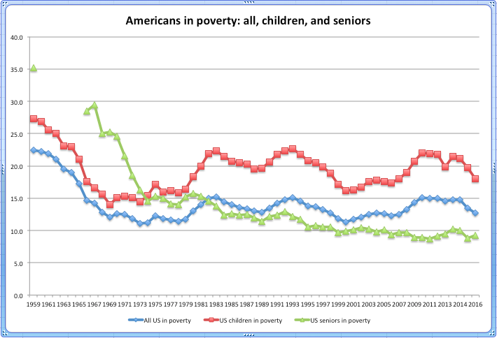
Brooks writes that “Sixty percent of seniors had incomes below $1,000 a year” in the 1950s. Again, I’m not sure what the underlying source for his claim is, but a flat number like that isn’t all that telling. Once more then, this time with feeling, here’s a graph of the percentage of American seniors living in poverty over the years. (I’ve combined it with the same percentages charted just above for all Americans and for American children):
Source: Table 3, Poverty Status of People, by Age, Race, and Hispanic Origin, U.S. Census Bureau. (Note: There are no data for seniors between 1960 and 1965.)
America has done better by its seniors than it has by its children or by its citizens generally (hi, Social Security!), but still, what the shape of the green line here tells me is that the yeoman’s work of ending poverty among seniors was done before 1973, and that further progress has only been incremental (and in the past twenty years, negligible).
Bonus round: Brooks, channelling Pinker, also claims we shouldn’t look back fondly to the 1950s because back then “only half the population had any savings in the bank at all.” Again, I don’t know the source of this claim, but unless we know how much was in those savings account, the statistic probably doesn’t reveal much except changes in banking habits. More suggestive, I think, are the data that Edward N. Wolff has assembled about the median wealth of US households. Here is a hasty chart I made from some of Wolff’s data:
Sources: Edward N. Wolff, “Household Wealth Trends in the United States, 1962-2013: What Happened over the Great Recession?” NBER Working Paper No. 20733, December 2014, and “Has Middle Class Wealth Recovered?” presentation at the ASSA Meetings, January 6, 2018. (Note: In his 2018 presentation, Wolff gave his numbers in 2016 dollars, so I divided his 2016 number by 1.03 to put it into 2013 dollars in the graph here.)
Was the typical American household in the middle of the economy wealthier in the 1950s? Full disclosure, the 1950s aren’t on this chart, so there’s no saying. But pace Brooks and Pinker, the “gloomy refrain” about the American economy—the reason observers feel pessimistic—isn’t that the economy has gotten worse since the 1950s, but that in about 1973 it stopped improving the lives of average Americans. And that seems to me to be confirmed by the blue line here: the middle-of-the-road American household made steady progress in wealth during the golden age, but the last few decades took it on a bubble-and-burst ride that left it no richer than it was in the late 1970s.


